As UAB Heersink School of Medicine continues to improve its digital accessibility, it’s important to avoid easy pitfalls that lead to noncompliance. Sometimes, these accessibility mistakes can arise because we don’t realize how specific features in applications are meant to function. Below, we will cover two common formatting issues in Microsoft Word and PowerPoint that cause issues for individuals using screen readers.
Headings in Microsoft Word
Headings within documents are important for all readers. For individuals without visual impairment, they provide information at a glance to know the content of each section. If readers want to skip to a specific section of interest, they are able to because of the header. For individuals with vision impairment, the same considerations should be provided. A screen reader can offer them the opportunity to jump to areas of interest based on the contents of a header.
Labeling of sections of content should be done carefully, however, as incorrectly applying header tags will leave the document unorganized and unnavigable. Follow the steps below to properly apply heading styles in Microsoft Word:
Step 1: Select the text meant to be a heading.
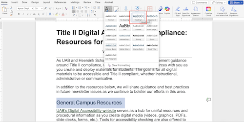
Step 2: Click the Styles option on the Home tab of the toolbar and select Heading 1.
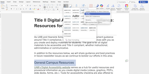
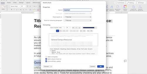
Step 3: Headings can be updated with your preferred font and text size by right-clicking the Heading 1 option in the same Styles menu and selecting Modify. Font and text size may be changed if desired, and the checkbox for Automatically Update may be selected to make this change throughout the document. Additionally, headings added to the document in the future will use this selected style.
Please note that simply changing the font size and bolding the font does not change its styling. In order for a screen reader to provide proper document navigation, it must be labeled as a header. If you would like to see your document’s navigation to confirm success, click View from the toolbar and click the Navigation Pane checkbox.
With the Navigation Pane open to show headers, you can see if your document needs multiple header levels. Do you have subheadings within the text? Again, do not simply increase the font size for these sub sections. Instead, apply the Heading 2, Heading 3, etc. style as needed to provide an efficient and effective user experience. While this is crucial for individuals with vision impairment, this organization is helpful for all readers, as they are also able to skip to specific areas of a document using the Navigation Pane. Another benefit to ensuring this structure is that if you are exporting the document to a PDF format, the reading order will transfer as well when applying accessibility tags in Adobe Acrobat.
SmartArt in Microsoft PowerPoint
While Microsoft PowerPoint generally provides an efficient user experience when creating slides with accessibility in mind, there is a feature that can accidentally undo all of your progress. Unfortunately, the SmartArt feature under the Insert tab lacks accessibility for screen readers. The offerings here, especially the lists, are organized and provide a fresh look for your slides; however, screen readers are unable to read any of the text content of a SmartArt element.
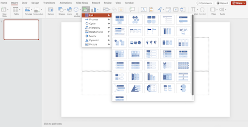
If your PowerPoint is simply presented to an audience and will not be distributed, this feature is a fine option. If you intend to distribute the PowerPoint digitally to users, though, it is best practice to avoid using SmartArt elements as the primary content on a slide. SmartArt elements allow you to insert alt text, but if you have an entire slide listing out important information, the alt text area does not provide enough room to include the slide text. It is best to use plain text on a slide for crucial content and use SmartArt elements to enhance the information or provide a decorative function.
Visit UAB’s Digital Accessibility website for useful resources and procedural information as you create digital media.