Here are some basic guidelines to design a visually appealing, well balanced poster:
Poster Layout
Poster Orientation describes how the poster will be displayed, and there are two options: Portrait and Landscape. Check for poster orientation requirements in poster session guidelines before designing.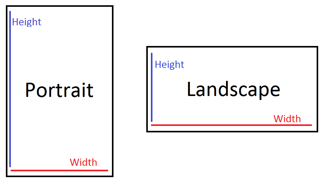 Portrait posters will have a larger height than width, and landscape posters will have larger widths than height.
You can manually select portrait or landscape by inputting the dimensions for your poster, or let PowerPoint orient your slide for you by inputting your dimensions and then selecting either portrait or landscape.
Sizing note: you only have to create a poster that will fit within the given display area, and do not have to create a poster that fills the entire space (for example a 48"x96" display area does not require a 48"x96" poster).
Guides and Gridlines are non-printing horizontal and/or vertical lines that allow you to align your content when laying out your poster. The guides snap content into alignment, and the gridlines allow you to manually line up content.
To use the guides or gridlines on a PC or Mac:
- Open PowerPoint, and select View from the top menu.
- If a dialog box opens, select Gridlines and Guides; if the View menu appears in the toolbar at the top of the page, check the box for Guides or Gridlines.
- The guides or gridlines will appear on the slide, and you may align your content. These lines will NOT appear when printed.
To move a guide, simply click and drag it. To create more guides, hold down the Control key and then click and drag on a guide.
Spacing
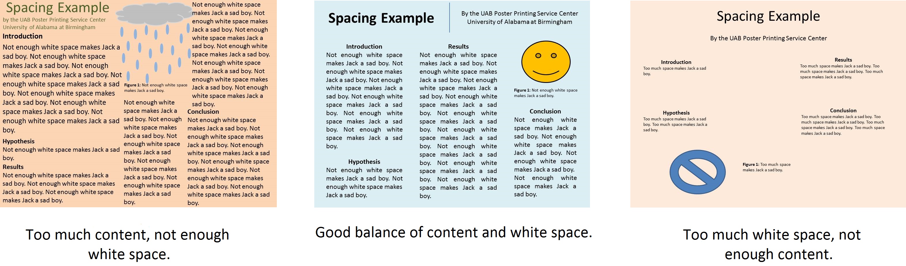
Spacing is very important for posters to be legible and look professional. White space (or negative space) is the design term used for unused space, and it is an important concept in design. Not enough white space makes the poster look messy, and too much white space makes the poster look incomplete.
Poster Color
Color Scheme & Backgrounds can help or hurt your poster presentation. Pick a background image or color that is easy to read off. Consider using a solid, light color background with dark text, or a dark background with light text.
If a color combination is difficult to read on your screen (like a bright blue background with red text), then it will be difficult to read on the printed poster and you should opt for a different color pairing.

Digital vs Print: Sometimes posters do not look the same on the screen and in person. Specialty colors or artwork (like WordArt, and background textures and fills) can be unpredictable when printed, so use with caution.
Poster Font
Poster Font should visually organize the poster for the viewer and make it easy to focus on the content. The most important thing is to be consistent with your design choices; all title text should be uniform, and all body text should be uniform.
- Style: The best font style to choose for a poster is the most legible font. It is advisable to use conventional, professional fonts such as Times, Arial, Calibri, Tahoma, Verdana, and more.
- Bold: Bolding the headings is a great way to organize your poster, but be wary of fonts that become difficult to read when bolded.
- Italics: It is not recommended to use italics for text that is crucial for the viewer to read; italics should be reserved for footnotes and other non-crucial text.
- Color: This is another good way to visually organize a poster while adding visual appeal. For example, instead of using only black font, you could use dark green for the title, dark blue for sub-headings, and black for the body text.
- Font Case: Use mixed upper case for titles (This is Mixed Case) and sentence case text for body text (This is sentence case). All caps (THIS IS ALL CAPS) can be difficult to read, so use sparingly.
Font Size can be used to denote headings, body text, and important information. Below is an example of sizes to use for a 36"x 48" poster. Note how the font size goes from largest (title) to smallest (captions). Commonly, the larger your poster is the larger your font will be.
Example of font sizing on a 36"x48" poster:
Title: 85pt.
Authors: 60pt.
Sub-headings: 54pt.
Body text: 32pt.
Captions: 24pt.
As for legibility, the following sizes are a good starting point:
To be legible from 6 feet use 30pt.
To be legible from 10 feet use 48pt.
To be legible from 12 feet use 60pt.
To be legible from 14 feet use 72pt.